Active programming
Spill-out space for coffee shops, restaurants, shops and similar uses makes the street feel more lively and welcoming. These uses are encouraged within setbacks along the public right-of-way.
Plainville, Massachusetts · Town Center District
The Town Center District Design Guidelines describe how new buildings along South Street, Bacon Street and the streets around them should meet the sidewalk, handle parking, and fit in with their neighbors. This guide lays them out topic by topic.
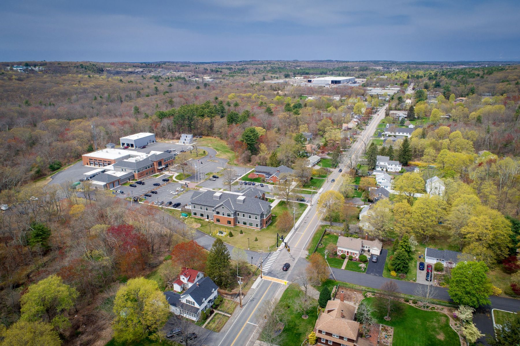
Based on the April 8, 2026 guidelines, a supplement to the Plainville Zoning Bylaw.
How the guidelines were written
The guidelines were drafted from November 2025 to March 2026 with the Plainville Planning Board and the Planning & Development Department, an online community survey, and a focus group of developers and property owners. The survey showed a community eager for revitalization but protective of its small-town character, with a strong preference for walkable, village-style architecture.
“I like the small-town feel - the community events, the closeness of everyone around.”
“I’m impressed with the future plans in the works for the center.”
“South Street has little to no shade, sidewalks feel exposed in many places.”
“There’s really no reason to even walk down the main street”
“Place for families and friends to gather and feel like a town center”
“The streets should be tree lined, the goal should be to encourage people to gather and create a sense of community.”
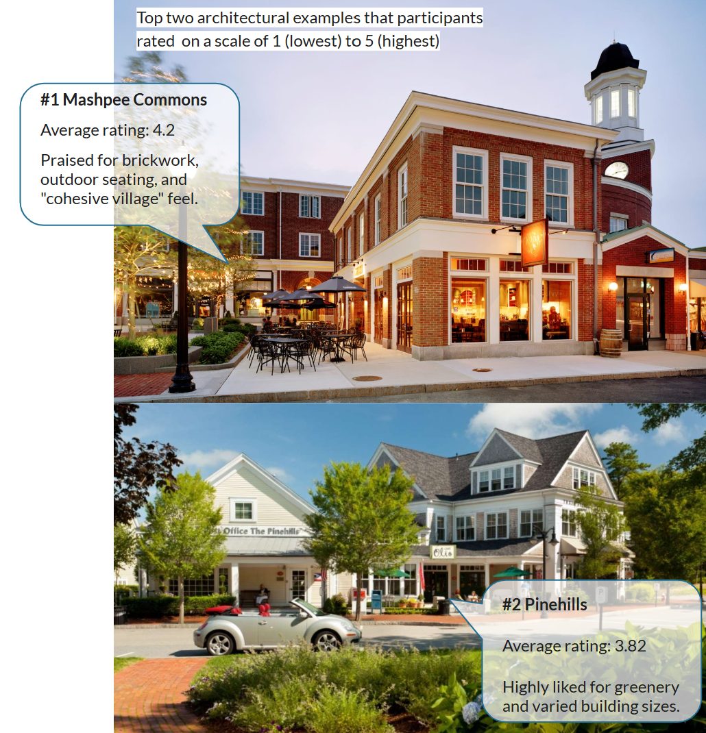
Survey participants rated photos of other places on a scale of 1 (lowest) to 5 (highest). The two favorites:
The focus group described the center’s shift from “everyday business” to “destination” and asked for more walkability and quality outdoor spaces.
Walkable streets
The guidelines promote a Town Center District where walking is easy and pleasant. What applies to a project depends partly on which kind of street it faces.
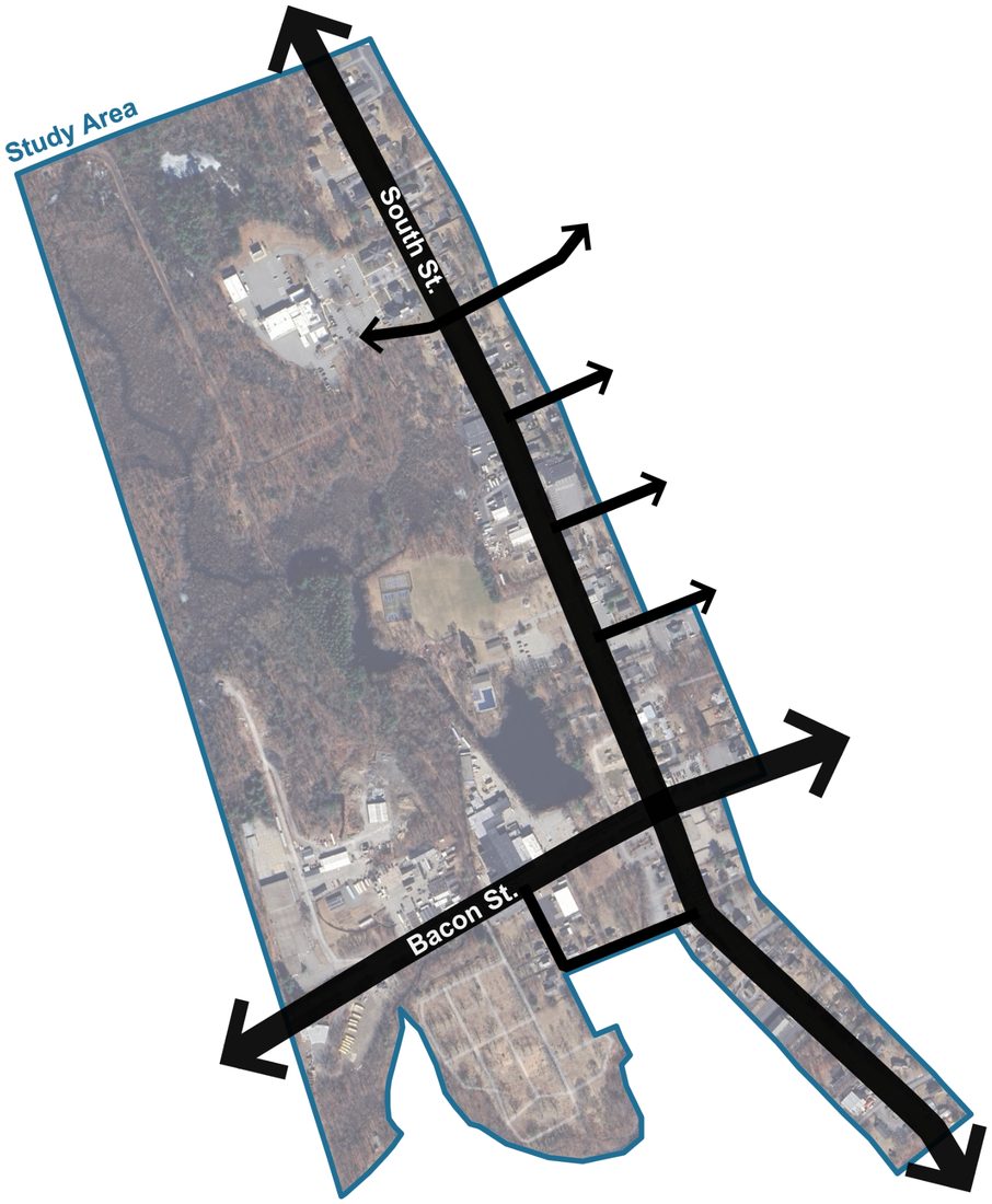
South Street and Bacon Street. As commercial corridors, active ground floors and inviting landscapes are required.
All other streets within the Town Center District. These connect the corridors with the residential neighborhoods.
Seven topics
Each topic states an aim, then lists what the town encourages and what it discourages. Two topics cover the site and five cover the building.
58 guidelines
ASite design
The space between a building and the sidewalk
Commercial streets feel more exciting when buildings line up closely along the sidewalk. On Plainville’s main corridors, South and Bacon Streets, it is important to keep a continuous street edge.
Where a building is set back from a public street, that space shall be a welcoming one, such as a mini-park or seating area.
Guidelines, page 6
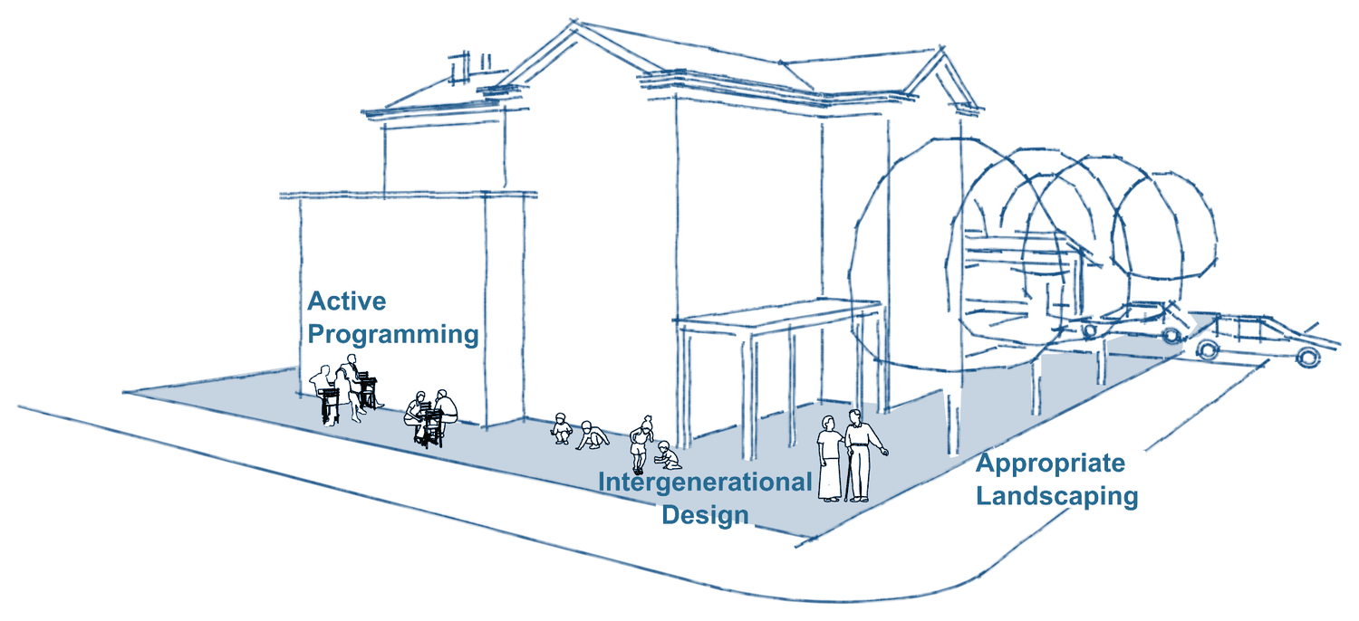
Spill-out space for coffee shops, restaurants, shops and similar uses makes the street feel more lively and welcoming. These uses are encouraged within setbacks along the public right-of-way.
Greenery in front of buildings should enhance the street, fit the context and match the building’s style. Local plants that need limited water are best, and hiring professional landscapers is recommended.
Garden beds should be large enough for plants to grow and stay healthy. Permeable pavement, trees and rain gardens improve the look of the area while helping the ground soak up rainwater.
Early in a project, consider who will use the space and find ways to make them feel welcome and represented in the design.
Setbacks in active zones should encourage social interaction between residents of all ages: varied seating with backrests for seniors, pathways wide enough for a wheelchair and a stroller to pass each other comfortably, low fences, planters or paving changes that create a safe boundary for children, and plantings with year-round textures and scents.
Permanent off-street parking must be located to the rear of the building. See § 500-26.
Residential areas on busy streets need more privacy than businesses do. Small gardens between the buildings and the sidewalk protect residents’ privacy and improve the neighborhood’s appearance.
Avoid oversized or “dead” setbacks. Design should favor active use over unprogrammed landscaping, walled-off vegetation or uninviting open spaces.
BSite design
Where cars go, and how everyone else gets in
Parking belongs at the side or the rear of the lot. Parking in front of a business may be convenient for drivers, but it makes the street look focused on private cars and ruins the “village” feel.
Sharing parking between daytime and nighttime uses cuts wasted asphalt and leaves more room for buildings or green space. Wherever the parking sits, design the site for pedestrians first, then cyclists, then public transit, and finally cars.
Guidelines, page 8
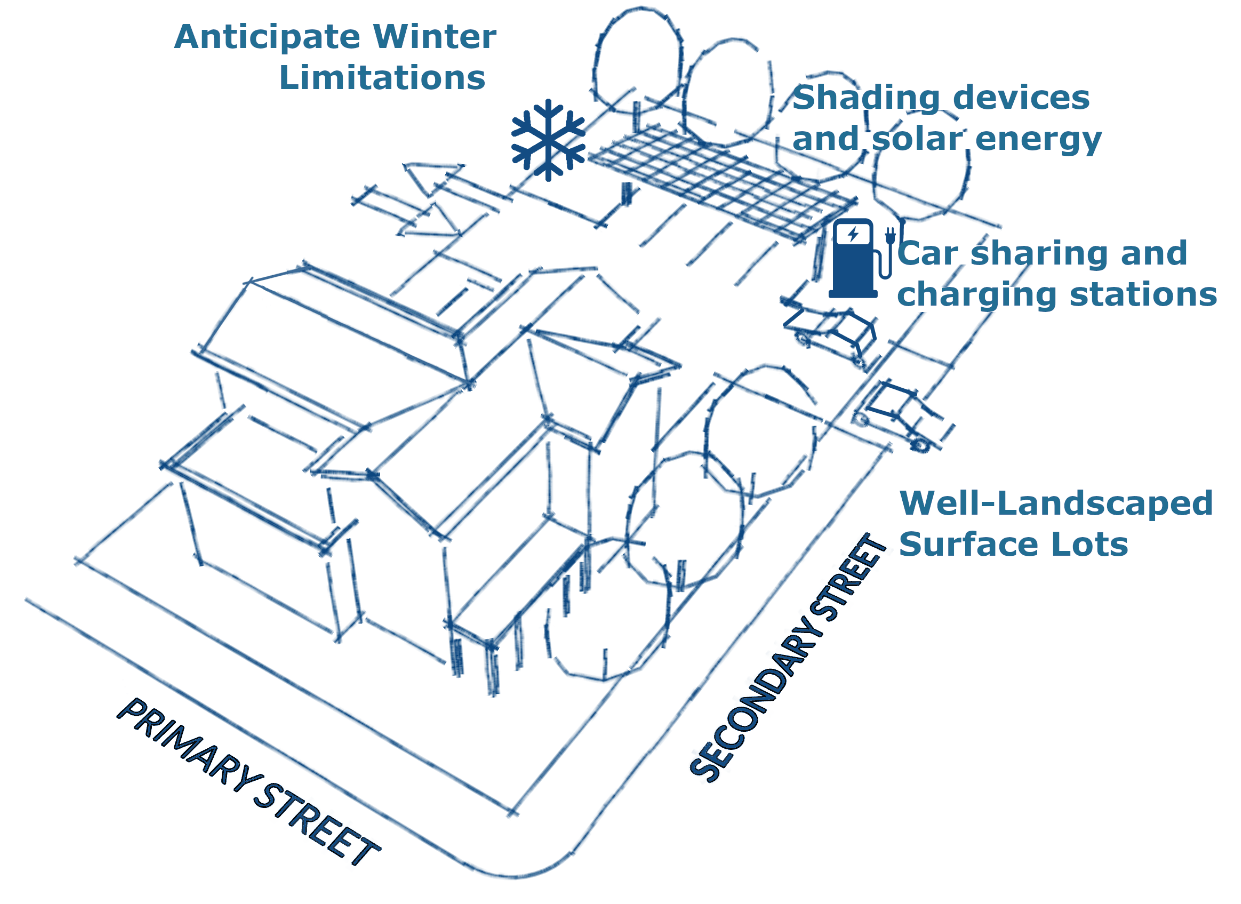
Look into sharing parking and driveways with neighboring property owners. Fewer curb cuts, preferably facing secondary streets, mean fewer conflicts with pedestrians, cyclists and other vehicles. Identify overlapping parking needs on the site when calculating minimum requirements.
Plant a mix of shade trees and local, hardy plants of varying heights in parking islands and along the edges to keep the area cool, filter stormwater and reduce the heat island effect. Include dedicated irrigation where feasible.
Interior parking areas must have enough shade trees to provide 50% shade within 15 years. Porous pavement or perforated brick is encouraged to manage runoff and groundwater.
Parking areas must be lit from dusk to dawn for public safety, with lighting shielded and directed away from residences to avoid glare.
Set aside parking spots for car-sharing programs to help reduce the total number of cars on the road. Consider dedicated spaces for electric vehicle (EV) charging.
Explore shade structures with embedded solar cells. They generate clean power and keep cars cool by blocking the sun.
Design adequate space for snow removal and storage.
Non-vehicular access should get equal priority to cars, and the site layout and circulation should show it. Safe walkways from parking areas to building entrances are required.
Ground-floor parking that is visible from the street must be screened from view. Climbing plants such as vines or ivy, or “green walls” (vertical gardens), can mask the parking area.
A physical screen used instead of plants must look professional and well designed while still letting fresh air flow through the garage. The parking area should not look like a dark, open hole in the side of the building. It should blend in with the architecture and the neighborhood.
ABuilding design
How a building meets the sidewalk
For a commercial corridor to thrive, buildings need to connect with the people passing by. A street is much more attractive when ground floors are full of life and have large windows that let people see inside.
A building’s shape and height matter, but how it meets the sidewalk is what people notice most. Entrances and windows should be at street level, easy to find, and designed so pedestrians feel safe and comfortable. Every entrance and path must be accessible to everyone, including people with disabilities.
Guidelines, page 10
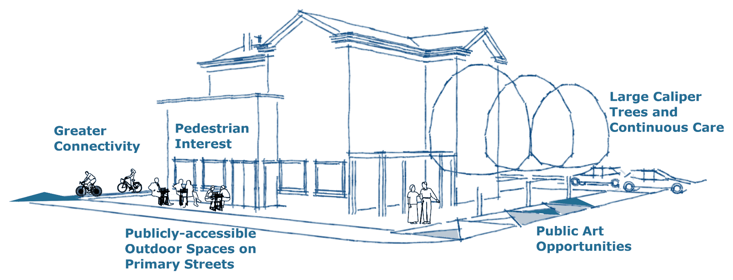
Buildings should have frequent doors, plenty of windows and high-quality materials. The ground floor is the part people see and use most, so it deserves the most detail.
Focus on how people walk or bike to the site from the surrounding neighborhood. Everyone, whatever their physical ability, should be able to move around safely and efficiently. Every project should include ample bike storage and easy connections to existing bike paths and walking trails.
Young trees take years to give shade and are more sensitive to disease and cold. Planting thicker, more mature trees helps them survive the move and gives the neighborhood an immediate boost. New trees should get continuous care for at least 5 years.
Small parks, plazas, outdoor seating and walkways make a street feel more alive and human. They let the public enjoy areas that are technically privately owned and give the community benefits that last long after construction. They are encouraged on the district’s primary streets.
Whenever possible, buildings should include public art and local culture: community meeting rooms, galleries, local artwork in lobbies, murals or outdoor sculptures. Art supports local creators, makes the building a better neighbor and gives people walking by something interesting to see.
Some new buildings meet open-space rules with space that is hidden deep within the building, out of public view, or is only a narrow, awkward strip along the edge. Avoid these leftover areas. Public spaces should be large and welcoming, and encourage people to spend time there.
Walkers, bikers and drivers should be treated equally. Buildings should sit close to the sidewalk, with parking underneath or behind.
Curb cuts, where driveways cross the sidewalk, create dangerous conflict zones between vehicles and pedestrians and slow traffic on main roads. New developments should keep them to a minimum. Fewer driveways are safer for walkers and bikers and easier for drivers.
BBuilding design
A building’s size and shape, and how it fits in
Massing means a building’s size and shape, and how it fits into its surroundings.
As new buildings get closer to existing homes, they should get shorter or “step down” at the edges so new construction blends with the neighborhood’s look and feel.
Guidelines, page 12
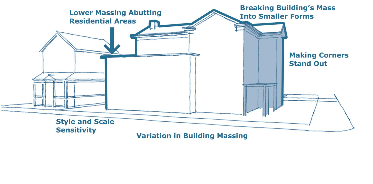
Dividing a large building into parts creates shadows and depth, so it feels human-sized instead of like a massive wall.
Additive: add exterior features such as projecting bays, dormers, porches, balconies, awnings and sunscreens, sized to match the rest of the design.
Subtractive: bring the facade in with porches, cut-out terraces or upper floors that step back.
A large new building in an older town should not look like a single flat block. Adjust the heights and shapes of different sections so it reads as a row of smaller, separate buildings. Strategies include changing the roof height, pushing and pulling the facade, and varying floor heights.
Corners are the most visible parts of a building. Treat the corner as a special feature so the building acts as a landmark: add vertical features, raise the corner’s height, angle the corner, or use pop-outs such as balconies or cut-outs such as recessed porches.
New buildings do not have to look exactly like the old ones, but they should “speak the same language.” Next to smaller homes, respect the height and feel of the existing houses by matching heights, lining up floors and using vertical patterns that follow the same rhythm.
A new building does not need to be a “fake” version of an old one. A modern style is often better, as long as the size and proportions feel in keeping with the neighbors. Familiar materials like brick, or window shapes that match those nearby, help a project look current and still harmonize.
Avoid “giant boxes” with flat, boring walls. New developments should not face the street with a single long, repetitive surface that feels endless or overwhelming.
When every building in a cluster looks the same, the area feels boring and nameless. Cookie-cutter designs strip a neighborhood of its personality and leave no visual landmarks to help people find their way.
CBuilding design
How tall, and how height changes near homes
Height is often a building’s most noticeable feature. Heights in Plainville’s town center have always varied. The former Plainville Stock and Wade Company reached four stories at the corner of Bacon and South Street, across from where An Unlikely Story is today.
Used strategically, height can improve a walkable center while preserving open space elsewhere. How a building looks from the sidewalk often matters more than its total height, and the right height depends on the buildings and streets around it.
Guidelines, page 14
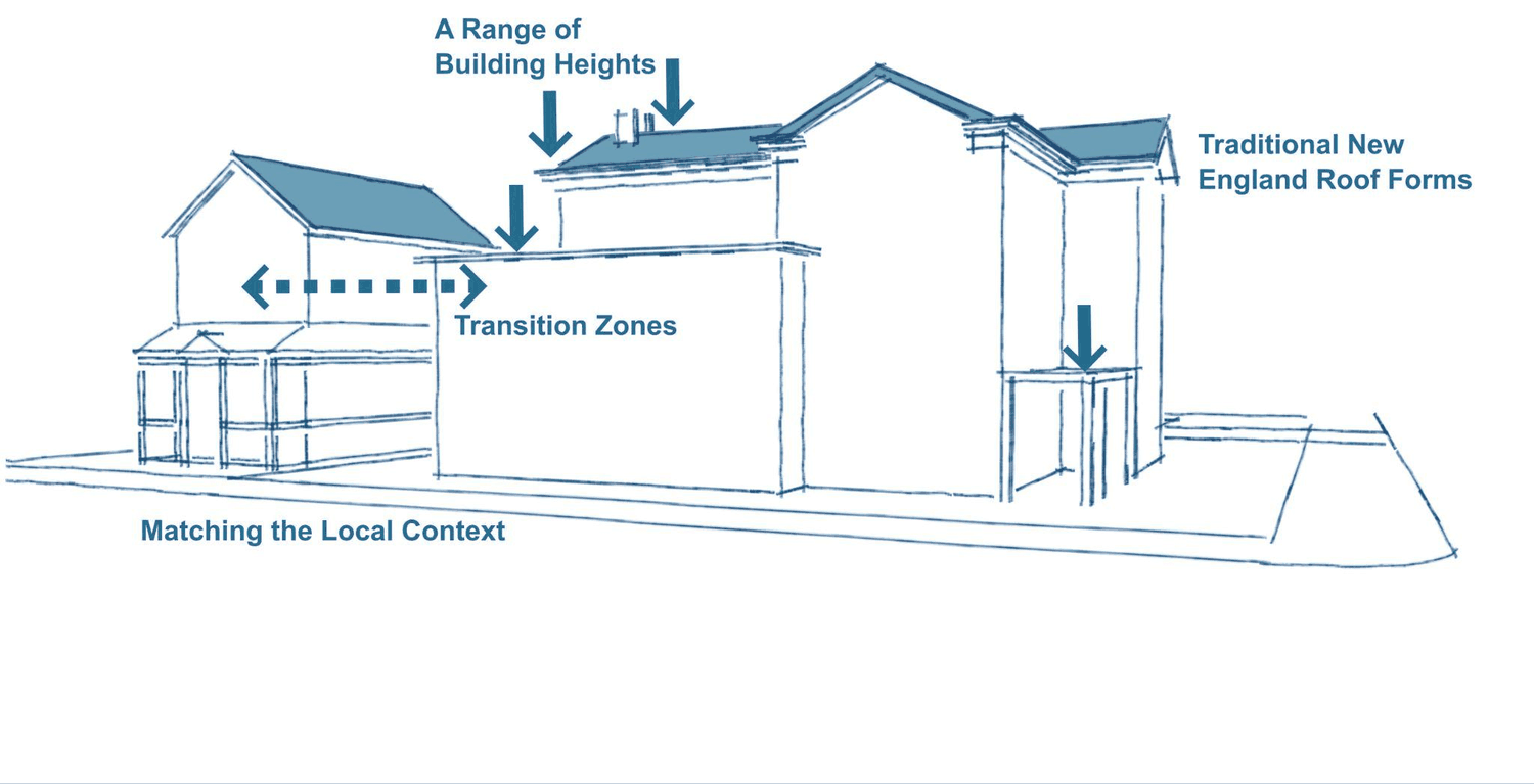
New buildings should respect the height of the structures around them. They do not need to be the same height, but they should fit in naturally with the street. Aligning floor levels, step-backs, rooflines and trim with nearby buildings creates visual harmony.
Large buildings should vary their roof heights so they do not read as one bulky mass. In large-scale developments the difference needs to be at least one complete story; small changes to a roof edge or railing are not enough. Smaller buildings can be more subtle, for example by slightly varying roof wall heights or making stairwells and elevator towers stand out.
New developments should gradually decrease in height as they move away from busy commercial streets and closer to local neighborhoods, so taller buildings do not overwhelm the smaller homes beside them.
Gable, hip and gambrel roofs are encouraged. Sloped roofs drain well and give the street a consistent, attractive look. Shed dormers must have a minimum roof slope of 3.5-to-12, steep enough to be finished with standard shingles.
New developments should be aware of the shadows they cast. Avoid shading public areas such as parks and civic spaces for extended periods, and take the same care with homes directly next to the site.
DBuilding design
What the street-facing walls and roofline look like
A building’s public facade is the whole side that faces the street, from the sidewalk to the top of the roofline. On corner buildings, both street-facing sides count as primary facades.
Design should favor the ground floor and the roofline, the areas that matter most to people passing by. The ground floor should hold active uses behind large windows. Heating, cooling and ventilation equipment on the roof should be concealed behind raised roof walls or decorative screens.
Guidelines, page 16
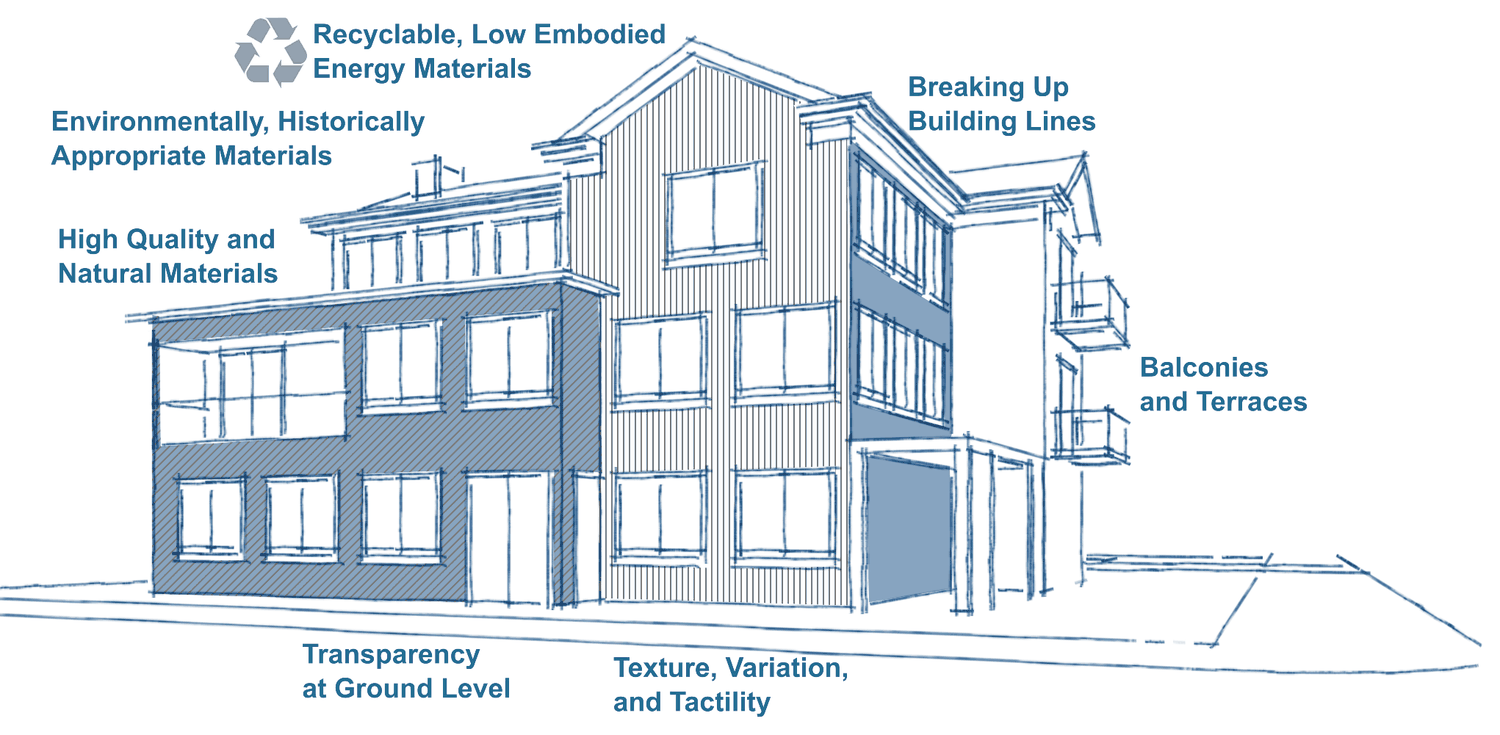
Filling the ground floor with cafes, shops and building amenities is a great start. Large windows let that activity visually spill out and make the street feel more vibrant. In some cases, retractable windows or doors help the business and the public interact.
Long, flat walls can feel impersonal and overwhelming. Break up long vertical and horizontal lines: highlight stairwells, group windows or add bay windows for vertical interest, and use upper-floor step-backs, rows of windows, awnings, canopies or connected balconies horizontally.
Balconies and terraces create depth, using light and shadow to make large structures more balanced and interesting. Balconies should be integrated into the architecture, and terraces carve outdoor space from the building’s volume. Both help residents and visitors feel connected to the street.
Choose materials for their resilience and their ability to age gracefully. Natural, sustainable materials that are easy to find and repair keep a building functional for years to come.
Choose exterior materials and detailing that can withstand the local climate and resist wear. They should honestly reflect the era of construction instead of imitating the past, while staying consistent with the historic New England character of Plainville’s Town Center.
Wood, brick and stone look solid from a distance and reveal textures and colors up close. Balance the variety: too few materials can look plain or cold, and too many can look cluttered and distracting.
Materials that take less energy to harvest, manufacture, transport and dispose of, or that can be recycled, lower a building’s environmental impact and the demand for new raw materials.
Low-quality, non-durable finishes age poorly and need frequent maintenance. Durable, attractive natural materials keep the building a lasting asset and reinforce its value in the community.
Large developments built for efficiency often end up with large, flat, repetitive facades that are neither beautiful nor distinguished and add nothing to the public realm.
Vary the depth of the facade with different setbacks, vertical gaps that run the full height of the structure, or added and removed sections of the building’s volume. With pedestrian pass-throughs and varied rooflines, even a very large building can feel comfortably scaled for people walking by.
Large blank walls bring no energy to the sidewalk and keep people from seeing into or out of a building. Without “eyes on the street,” a neighborhood can feel less safe and the building looks closed-off, like a fortress.
Porches and balconies too narrow for chairs or a small table are just for show. They need to be deep enough for people to sit outside and enjoy them. Empty areas such as ledges are great spots for rooftop gardens.
EBuilding design
Signs sized for people on foot, and a dark night sky
Signs and lighting add character and help a community express its identity. They must be designed safely and respect the local environment, especially after dark.
Businesses need to advertise, but signs in the Town Center should work without creating visual clutter. What works for a suburban strip mall usually will not work for a downtown street.
Guidelines, page 19
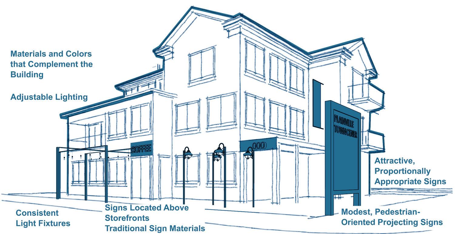
Signs should feel like a natural part of a building’s architecture, sized for how people will see them. A building directory meant for pedestrians should be small and simple to read at close range. Signs meant for drivers need to be larger and more visible.
Durable materials like carved wood or raised metal letters are preferred because they age well and stay in style. Sign materials should match the building and coordinate with the look of the surrounding neighborhood.
Signs that hang perpendicular to the sidewalk are easier for walkers and cyclists to see. They should match the building’s style, hang high enough to stay out of the way of people walking, and be readable at a pedestrian’s pace.
Signs should sit as close as possible to the business they represent, ideally directly above the main entrance or the shop windows.
The colors, materials and style of each sign should blend with the building’s design and get the same care and detail as the building itself.
Choose fixtures that match the building’s design. If they cannot be hidden or built in, place them where they are least noticeable. Architectural lighting must always point downward or toward the building, never toward the street or the sky.
To protect local wildlife, lighting should follow Dark Sky principles by limiting blue light and using warmer tones. All site lighting must be shielded and aimed downward so light does not spill onto streets or neighboring properties.
Pole signs and other standalone signs not attached to a building are discouraged. They often look like afterthoughts and are usually too large for a pedestrian-friendly area.
These signs often spill light onto neighboring properties, are usually made of low-quality materials that do not last, and are typically too large for pedestrian areas.
Signs will vary with the business and the building’s style, but they should follow a consistent pattern in size and placement. Avoid poorly designed, cluttered or randomly placed signs.
Rooftop billboards and any signs that extend above a building’s roofline are not allowed. The town may occasionally approve blade signs or marquees that extend above the roof if they are mounted to the side of the building, decided case by case.
Flashing lights, moving parts, animated signs and beacons are prohibited unless specifically authorized by a special permit.
Intense nighttime lighting harms Plainville’s wildlife, especially migrating birds and nocturnal insects. On primary streets, lighting should be controlled so it is used only when people are present. On secondary streets, exterior lights must be dimmed or turned off by 11:00 PM or within one hour of closing, whichever is later. Security lighting that stays active after hours must use motion sensors set to turn off within 10 minutes.
No guidelines match that search. Try a different word, or clear the search box.
Where the guidelines get specific
Most of the guidelines describe qualities. A few set a number. Select one to see where it comes from.
Planning terms
For applicants
These are the questions from the checklist at the back of the guidelines. Use this page as a practice worksheet to see how a proposal measures up. Nothing here is submitted to the Town. The official digital form is available on the Town of Plainville website via OpenGov.
A living document
The Design Guidelines are meant to evolve with the Town’s changing needs. Comments and perspectives are invited and will inform future updates.